Projects
Vhi Online Doctor
Created for Vhi at Graphite Digital


Vhi, the biggest private health insurer in Ireland, asked Graphite Digital to work with them on optimizing their Online Doctor GP app service. As the Covid-19 pandemic developed, telehealth services became absolutely essential, since many patients were no longer able to access a GP face-to-face.
We undertook user testing, wireframing and concept testing to learn about customer impressions of the old experience and identify needs and pain points before implementing our learnings and producing an MVP version of the improved Online Doctor experience in the Vhi app. I was leading the design and research side of the project.
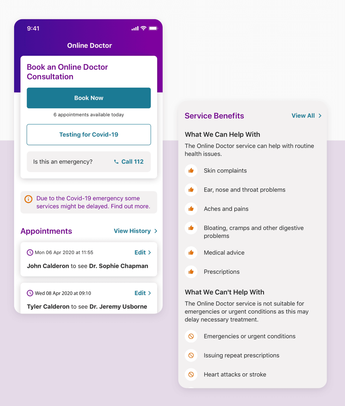
The new experience allowed users to quickly access medical services from the comfort of their own home, which drove a rapid increase in new app users and engagement. It quickly became one of the most used and valuable features they offered.

Business needs
The need for this project arose due the fact that Vhi had to part with their Online Doctor third party provider back in 2019, and as a result the service was taken out of the app, which hindered the customer experience.
The feature was seen as instrumental in increasing app engagement and making sure customers could get the medical care they needed, especially during a global pandemic.
Feature requirements
The task was to work together with the new partner on optimizing the Online Doctor service and bringing it back into the app with the new look and improved experience. This would help improve the overall customer journey and experience when interacting with the Vhi Online Doctor feature, as well as creating consistency.
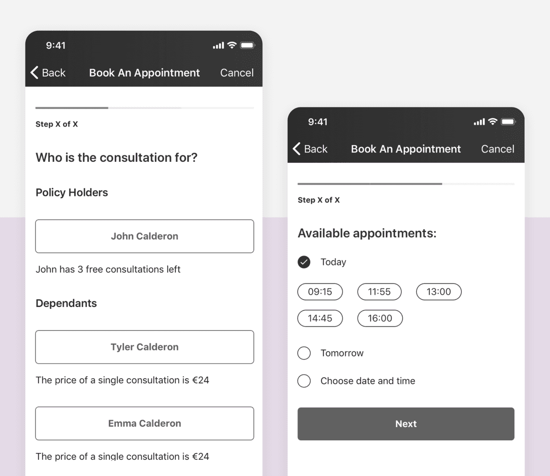
The new provider had similar requirements compared to the old one, so we had to take the original user journey as a starting point. However, we felt that the journey didn’t provide the best experience as most of the information was displayed on one screen. We then broke it down into smaller, more digestible steps and user tested the two, with our assumptions being confirmed as a result and the latter version being a clear winner, due to the fact that it was a lot clearer to the user what needed to be done during each step of the journey.


On top of that, there were other user pain points and frustrations we identified. From the user perspective, one of the issues was the fact that when booking for dependents, policy holders would often book for themselves, which was incorrect and resulted in a poor customer journey. Other pain points included not being able to find relevant information on the various ailments the service could and couldn’t be used for, as well as understanding their upcoming appointments and what they could expect from them.
From the clinical perspective, we had to cover every scenario to ensure there would be no dead ends in the user journey and each patient could get the medical care they needed. For example, the service is not available for children under 2 years old, which meant we had to point to an alternative service that could be used by those patients.
Design phase
Once all the requirements were gathered, we began working on the first phase of our designs which included the booking and consultation experiences, as well as appointment history. Since we collaborated closely with the service provider, it unfortunately meant that there had to be tradeoffs. For example, additional fields had to be added to ensure that the provider was going to get all essential data prior to each appointment, which resulted in a longer and slightly more laborious user journey.
Results
The feature has seen dramatic success since the launch, and the user experience has improved significantly, which we could see from both SUS (System Usability Scale) test results and analytics. Users appreciated the streamlined booking and consultation process, clearer instructions and expectations as well as easier access to important service information.
Launched in August 2020 the feature resulted in service usage increase by 291%. After three months, the use increased by 407%.
The feature has seen dramatic success since the launch, and the user experience has improved significantly, which we could see from both SUS (System Usability Scale) test results and analytics. Users appreciated the streamlined booking and consultation process, clearer instructions and expectations as well as easier access to important service information.
In addition to that, the number of successfully completed appointments quadrupled within the first 3 months, from 1,244 to 5,063 per month.
There also was a 33% increase in successful appointments booked for children, and the number of incorrect bookings reduced significantly.
Vhi’s overall app rating on the App Store benefited from the launch too, growing from 4.5/5 to 4.7/5 following an increase in positive user feedback.


Refinement
Post MVP, we kept monitoring customer feedback and service analytics, and conducting additional research that helped us identify and address user pain points. As a result of that, we improved the service further and added some of the highly requested features and functionalities (e.g. payments, international users, adding images).