Projects
Vhi Design System
UX
UI
Created for Vhi at Graphite Digital


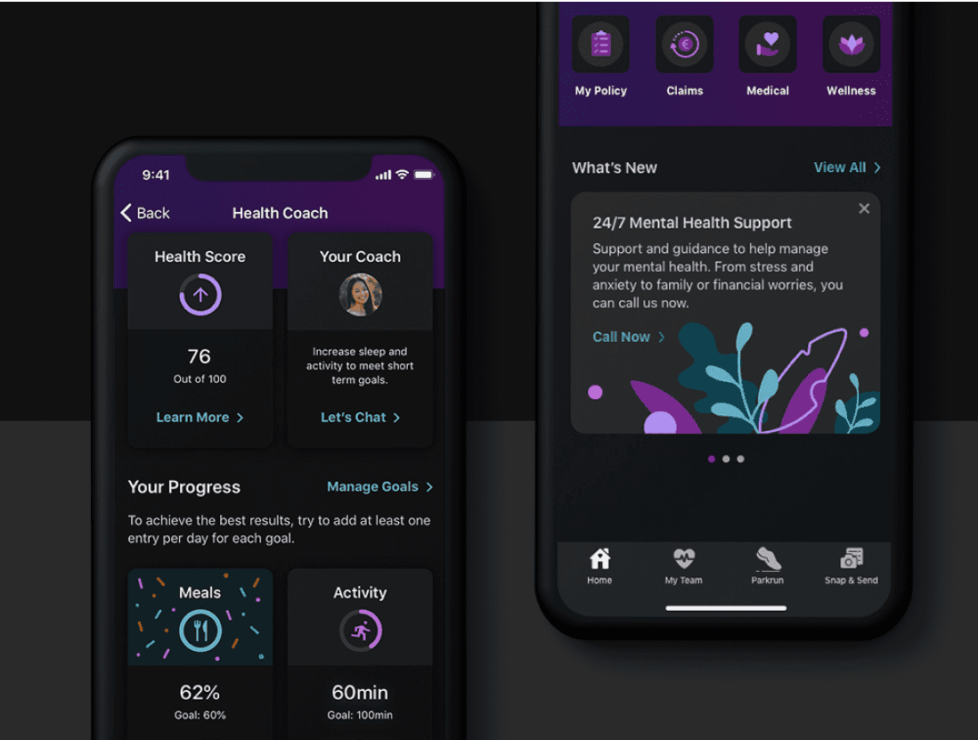
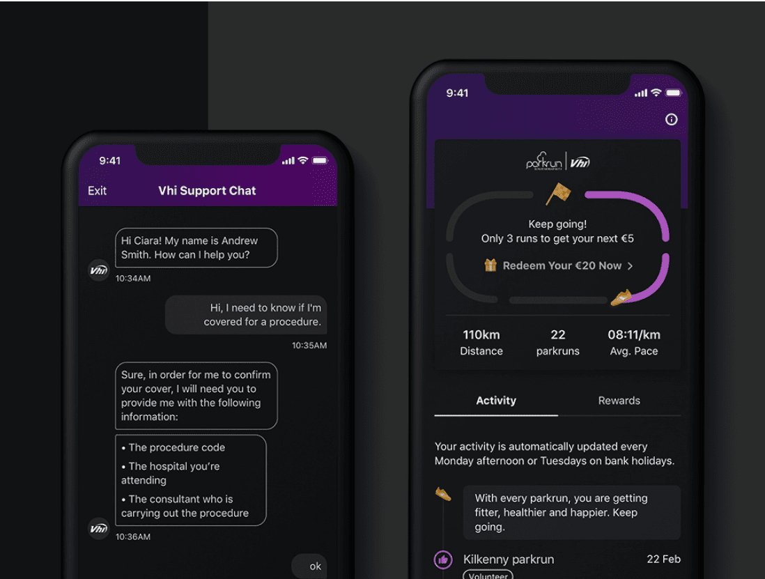
Vhi, the biggest private health insurer in Ireland, tasked us with re-branding their mobile app, and creating a new design system that could be used across both of their native apps (iOS and Android). My role was the actual creation and maintenance of this design system, in line with Material Design, and in two color modes: Light and Dark.
Light mode
The first step to designing this design system was taking the brand colors and bringing them to the present day. Vhi is an established company, and attracting a younger audience is one of the challenges they face. The new design system had to look fresh and modern. We also made sure that our new color pairings met at least AA accessibility requirements.
While building the design system out, we had to follow platform and Google Material guidelines quite closely. Due to tight deadlines, all components had to be created in parallel with actual features, so we had to move quickly while still making sure our components were flexible, and we would be able to use them for different types of content.


As we added more features, the design system grew, and we were able to spot patterns in terms our component usage, which in turn resulted in further updates and allowed us to streamline the components we ended up with. Now we have built solid templates that are suitable for a variety of different features, and we can build new screens in a quick and consistent way.

Dark mode
Once we were happy with the way our design system looked in light mode, we created the dark color scheme. Dark mode reduces eye strain, improves visibility for users with low vision and those who are sensitive to bright light, and helps save device battery, so it was quite an important feature for us to introduce.
Despite the advantages of dark mode, it also has some cons. Long pieces of content or text become more challenging to read, especially on smaller devices, like cell phones. That's why it was important for us to user test both color schemes, and ensure that switching to dark mode would not affect the usability of the app in a major way.
File setup & documentation
Due to the fact we had to deal with two different platforms and two different color themes, we made sure that our filing structure was clean and simple. This also allowed us to be able to switch from color one mode to another with a click of a button, by utilizing a Sketch plugin.
The client selected InVision DSM for storing components and documentation. The platform ensures that the design system is used collaboratively by both designers and developers, and allows the development team to store code alongside each component.