Projects
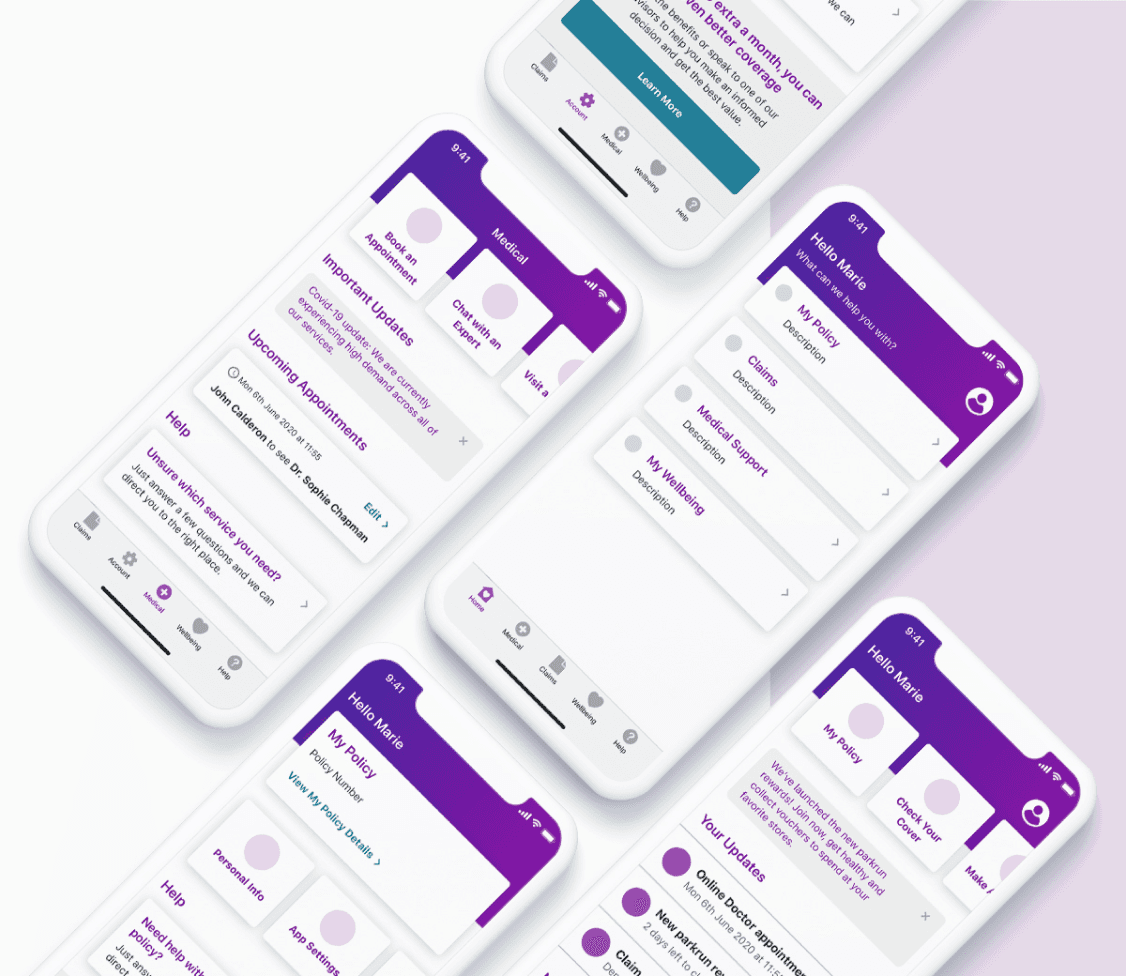
Vhi App Dashboard
User Research
UX
UI
Created for Vhi at Graphite Digital


Dashboard is an important part of an app - it can serve as a gateway to various features, help users complete tasks and display essential information. That’s why redesigning the existing dashboard was one of our priorities when we started working with Vhi, the biggest health insurer in Ireland, on their app. I led the design and user research side of the project.
Reviewing the numbers
Our first step was reviewing analytics across all app features so we could identify any gaps and potential issues. Even though the app had a lot of different features, we noticed that users mainly went to just one of them. Many others had very low usage, and we wanted to understand the reason behind that.


Speaking to active users
We conducted user interviews to ensure that the dashboard we were creating was designed with the needs of the user in mind. Those interviews helped us better understand the ‘whys’ behind the findings we uncovered through the analytics .
We found out that most users were coming to the app with a specific task in mind that they wanted to complete. Therefore, they didn’t take the time to explore the rest of the app and had no idea how many additional features and services were actually available to them.
Users also mentioned the fact that the existing dashboard was cluttered and full of promotional items that were not personal or useful to them, so they would disregard that screen entirely and navigate somewhere else straight away.
Stakeholder goals
As a business, Vhi wanted to transform the dashboard into a dynamic tool for engaging customers, inspiring them to explore various features and services, and increasing their overall interaction with the app—all while ensuring users could easily accomplish their intended tasks.

Project goals
Speaking to both customers and stakeholders helped us define the right goals for this project. We needed to make sure that users were able to complete tasks quickly and easily, have the dashboard as a space that was more personal and useful to them, and showcase relevant features, so that users can become aware of their benefits.

Concept testing
Based on our findings as well as user and business goals, we created three concepts. We then showed them to the client first, to ensure that they were technically possible and aligned with their vision.
We then tested those concepts with actual app users. Even though there was a clear winner, the final version was a combination of two designs, since both users and the client felt that the chosen prototype was missing a promotional feature.
One of the most interesting findings we uncovered was the fact that the client and the users had different meanings of personalization. We were initially planning to allow users to select what they wanted to see on the dashboard themselves, which would have involved a lot of technical work. However, just having their name displayed made the app feel more personal to the users, which was a lot easier to implement and saved the team a lot of time and effort.
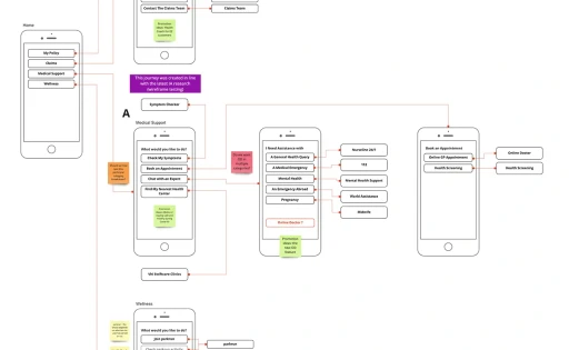
Refinement
The next step for us was to refine the designs further, and also test all new user journeys that were created. We did it through unmoderated testing, and it helped us validate every design choice we had to make.
Launch
Once the dashboard was released, we conducted further usability studies, to understand the impact of the launch. The overall feedback was very positive, with 90% of users preferring the new dashboard. The insights also helped us inform future projects.
Since the new dashboard improved feature discoverability, it also contributed to an increased usage of services that had previously been buried within the app, which was one of the main business objectives.